When used correctly, safety posters can be an incredibly effective communication tool in the workplace.
But there’s just one problem—almost no one uses them right. This means there are thousands of companies that can make safety improvements if they learn to better deploy safety posters.
Maybe you haven’t thought much about safety posters. If that’s the case, this guide is for you.
Compared to most EHS issues, safety posters are relatively straightforward. But there’s a lot more to them than just buying one that looks good and then slapping it up on the wall.
In this guide to using safety posters, we’ll break down why posters are a great form of safety communication, how they work, and what safety professionals, training departments and steering committees need to do in order to wring as much value from posters as possible. We’ll also address how to design an effective poster, where it should be placed and for how long.
One quick note: We’re not going to sell you any posters in this blog post. Our advice is impartial. But rest assured, we know what we’re talking about. We’ve been to thousands of worksites around the world and when it comes to safety posters and other visual displays, we’ve seen the good, the bad and the just plain weird.
We know that a poster can have a huge impact on employee engagement with safety, and we’re here to share best practices, tips, and tricks we’ve learned for using safety posters effectively.
What’s the point of safety posters?
Let’s start by taking a look at what safety posters do. Despite the endless variety of posters out there, almost all of them fit into one of these categories:
- Milestones, goals, progress
- Behavior change and motivation
- Compliance requirement
- Informational, awareness (this is the most important one)
- Support for larger initiatives
- Systems and processes
- Event announcements or training schedules
- Wall charts for reference
Let’s take a closer look at three of the most common types of safety posters.
A safety display may commemorate a milestone such as reaching a year without lost-time injuries. Publicly marking safety achievements is important, but no one’s going to get hurt if you don’t get the messaging quite right.
A required safety poster displays what type of PPE someone needs to wear, identifies common hazards and presents other pertinent information as mandated by law. Required posters are a component of complying with health and safety regulations, but it’s important to remember that compliance isn’t everything. (In fact, compliance may not even be enough for forward-thinking organizations to achieve their safety goals.)
It’s worth noting that many required safety posters aren’t posters at all—they’re notices. A notice consists entirely of words and is not as inviting to look at as a poster. A notice is used to deliver important information. How do you use a notice? It’s pretty straightforward: many jurisdictions require you to display it by the entrance and keep it away from other posters.
And then there are informational posters. It can be an incredibly powerful form of safety communication and it’s the type of safety poster that’s most likely to have a daily impact on worker safety. It reminds workers about safety requirements and best practices. It can also be motivational, encouraging employees to make use of their safety skills and awareness.
Every type of safety poster is important and you should strive for a healthy mix throughout your facility. But the type of poster that is most commonly found in worksites is the informational poster. It’s also the hardest type of poster to use correctly.
So for the rest of this guide, we’ll focus on informational posters. (But the design principles and other suggestions can be applied to the other types of posters too.)
How safety posters work
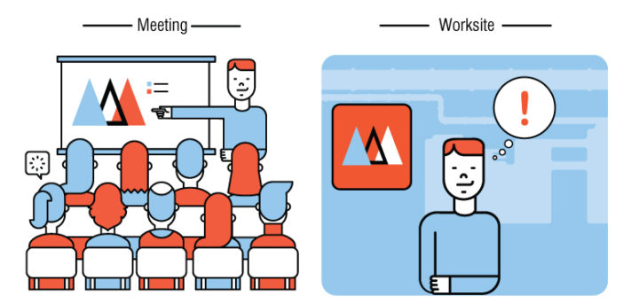
A lot of different things need to go right to make a great safety poster. But at its heart, each safety poster has one simple purpose: to reinforce safety training and meetings. Its job is to help employees recall key information at times when they’re most likely to need it.
When workers see a safety poster, they should instantly be reminded of a best practice they learned in safety training, think about a hazard they’ve already been told about, or recall a safety issue they need to be mindful of.
Everything about safety posters—from what’s on them, to when and where they’re displayed, and how many of them to use—is predicated on the fact that the posters are meant to be a reminder of safety training and meetings.
Safety poster no-nos
If safety posters are intended to help workers remember key issues from safety meetings, there are a few issues that will limit a poster’s ability to catch workers’ attention and get them thinking about safety. Before we dive too deeply into creating and using posters, let’s take a quick look at what not to do.
Issue #1: Too much information
When it comes to safety posters, you can definitely have too much of a good thing. Excess information crammed into one safety poster or scattered across multiple posters can distract viewers, inundate them with info and cause the posters to be ignored. Well-crafted posters should aim to reinforce a single piece of information, not regurgitate an entire safety lesson.
Issue #2: Fail to rotate
When the same safety poster is left in the same location for a long period of time, people stop noticing it. It fades into the mental background. This phenomenon is called inattention blindness and it has a lot of safety repercussions, from increasing the risk of slips, trips and falls to reducing the effectiveness of safety posters over time. Safety posters need to be constantly rotated to new locations and old posters should be swapped out with new ones. (But more on that a little later in this post.)
Issue #3: Try to teach something new
Learning takes time. Glancing at a safety poster is enough to trigger someone’s memory on something they already knew, but you can’t rely on the poster to teach something new or complex. Think of safety posters as an echo: they should only repeat ideas, concepts and practices that have already been discussed in training or meetings.
Issue #4: Copyright infringement
When creating your own safety poster, it’s tempting to pull images from the Internet. If you get lucky, you might even find complete posters that you can download, print and use. But if you didn’t pay for it, you’re likely infringing on someone’s copyright. Make sure you have the right to use any visuals that you find online.
Make your own posters or buy them?
Before wading into the visual elements of a safety poster, let’s take a minute to talk about an age-old dilemma: do you make your safety posters in-house or buy them from a vendor?
There are pros and cons to both approaches. Making them yourself allows you to customize the look, feel and messaging of each poster. But it takes time and requires you (or someone in your organization) to have the necessary skills and software.
Local print shops may also offer design services or help you find a local freelance designer to work with. Regardless of who you use, good design makes a big difference. And since safety is so important, it is worth making every effort to be effective.
Buying posters, meanwhile, can seem easier. But it will also cost money, and the options to customize are often limited. And “easier” rarely means “better”.
It’s worth noting that some safety training providers offer safety communication kits that include posters. As an added bonus, these posters will likely be tailored to reinforce important messaging and should already integrate with existing safety programs. Hiring companies that offer kits like this can often save you a poster-sized headache down the road.
In the end, whichever method you use, you should keep the principles outlined in this blog post in mind, as they will help you create, select and/or purchase more effective safety posters.
Anatomy of a safety poster
Now that we’ve gone over how safety posters work in theory, let’s discuss what they should actually look like. Whether you’re making your own posters or purchasing them from someone else, it’s important to know how the layout and design elements affect a poster’s efficacity.
Posters should be designed based on how people instinctively view them. When people look at posters, their eyes typically start at the top (which makes it a good place for a headline) and then move left to right, top to bottom (like reading a book).
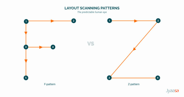
The poster needs to be designed to lead the viewer through the work presented separating things like the headline, supporting material, images, etc. by formatting and spacing—directing the viewer’s attention to the different sections in a systematic way.
Here’s a breakdown of common elements of safety posters. Every poster won’t have every element, and these aren’t hard-and-fast rules. But for the most part, effective safety posters contain these principle elements.
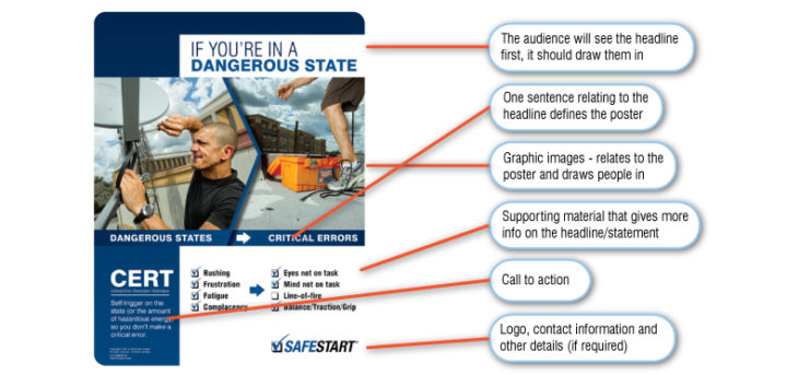
Headline
The headline should be direct and specific enough to draw people in and make them want more. According to advertising guru David Ogilvy, “five times as many people read the headline as read the body copy. When you have written your headline, you have spent eighty cents out of your dollar.”
The headline needs to let the people know what your poster is about—in a deliberate and succinct way. And for posters that don’t have any additional words, the headline may be the only way to provide context.
Statement
If the headline doesn’t make clear what the key message of the poster is, the statement should consist of one sentence relating to the headline that defines the poster in a way that the headline couldn’t.
Images
A picture is worth a thousand words, so make sure you choose an image that says exactly what you want it to. Remember that your poster is supposed to give a quick overview of your overall message. Images are a great way to grab someone’s attention and explain your message at the same time.
Spend time to find the right images as they can make or break your poster. There are a lot of sources where you can purchase affordable royalty-free or stock images, including Pexels, Pixabay and Unsplash.
Or better yet, take high-resolution pictures within your own facility. People always pay more attention if they recognize the pictures you’re displaying. When used correctly, an image can increase understanding in ways that words can’t.
In fact, according to 3M Foundation, the brain processes visual information 60,000 times faster than text. But they need to be relevant to your message. Poor quality or generic images are a fast way to negatively impact understanding.
Note that images aren’t mandatory: sometimes a strong headline or a specific statement in a common safety language can be effective.
Supporting material
Any additional details or instructions should go here. Try to keep them as brief as possible and resist the temptation to put too much information in the supporting material. Try using bulleted lists instead of complete sentences. Often, they can succinctly get the reader’s attention and convey only the most important information.
Required posters often need to be stated matter-of-factly, but other posters—especially those that are meant to prompt behavioral change or habit development—should always be authored for positive reinforcement.
Check your message to see if it is condescending to your audience. Often, people know what to do, and they just need a reminder and reinforcement to know it’s okay to take the time to comply with safety rules. Know the tone of the poster and what will accurately convey your message (e.g., sometimes humor is not appropriate for certain safety topics).
In some cases, supporting material may not be necessary if the headline, statement and image make it clear what safety issue you’re trying to reinforce.
Conclusion
This could be a brief call to action or other pertinent details that need to be communicated to close the poster. This can be combined with the logo, contact information and other details section.
Logo, contact information and other details
A good brand will allow people to know your design without having to read too much to identify it—familiar design, tone and foundation are the pinnacle to achieving that. If the poster looks similar to other pieces with the same message, the visual trigger on the memory will be stronger to reiterate that message.
If a logo or contact information is required on the poster, try to keep them small and at the bottom of the poster so they do not detract from the message you’re trying to convey.
Other design considerations for safety posters
Whether you make your own posters or buy them, being knowledgeable in all aspects of what constitutes a good poster is vital to the success of a poster program. Here are some design tips beyond the skeleton of the poster that will help you identify what to look for in a good poster.
Color
Safety posters only work if they capture people’s attention—usually from a distance. The best way to do that is with bright contrasting colors between the poster and its surroundings. Choose wisely, because colors have different meanings and too much contrast can look unprofessional and untidy. If possible, work with your company’s marketing department to coordinate colors for your brand or buy posters that have been designed by a professional.
Sometimes it pays off when you dare to be different, but you must keep your intended audience in mind. Too many colors, bright or clashing colors can really depreciate the poster.
Font use
Typically you want to limit your poster to a maximum of two different fonts that are complementary to the tone of your poster. Too many font types make it hard for the eye to consume the information being presented. When using colored text, make sure it complements the surrounding elements and background—colored text can often be camouflaged and the intended message is lost. Another important consideration is the use of text formatting (bold, italics, underline, font size and justification) because too much formatting will impede reading. As part of the formatting consideration, use letter case as opposed to all caps for all text.
Quality not quantity
It’s easy to want to put as much information on the poster as possible to best inform the reader. But too much information will actually limit the poster’s usefulness. Keep the design simple and allow enough white space (blank space around graphics and text) to ensure the intended audience doesn’t get lost or intimidated by the overall appearance of the poster.
When to display safety posters
A planned poster campaign is the most effective way to deliver your intended message. Determine what type of posters you are displaying to ensure the right kinds of posters are being rotated into the mix.
If your facility uses a media player, don’t forget to produce electronic posters along with physical ones. Electronic posters are usually played in a loop and their display time is limited. Though they may seem dramatically different—and the mediums certainly have different design requirements—their goal is the same as physical posters.
A printed poster will typically be used on your safety board. Take into consideration how the poster looks once it’s printed and whether it will be displayed on its own or with other posters. If it competes with other posters for attention, then one of the posters will gain most of the attention—at the expense of the others.

In addition to fighting for attention, a group of posters can look like a wall of “clutter” and get overlooked as a result. It’s a good idea to create a poster cycle to ensure the messages stay fresh and workers don’t become complacent about them.
Ideally, posters should be displayed in high-traffic areas. Some places, like a break room or elevator, will expose people to safety posters for longer periods of time.
While a safety board is a good place for employees to consistently look for information, your poster should be displayed in an area relevant to the poster. For example, a hand-washing poster should appear near a sink or in a washroom while a PPE poster is best suited at the entrance where PPE is required to be worn.
Schedule your safety poster rotation
When creating your poster cycle, the timing of your poster should allow enough time for people to take in the message but it should not become a permanent fixture on the wall. The schedule for changing out the posters should be set with your monthly safety meetings.
This not only keeps people from becoming complacent about the messaging but it also connects the message delivered in the safety meeting to the poster. The change will grab the attention of the employee, and when the message is something they have already heard it will trigger a sense of familiarity. It will also provide a valuable opportunity to reinforce your safety meeting or reiterate key EHS messaging.
Conclusion
As you can see, there are a lot of different factors that you need to get right in order to use safety posters effectively. Fortunately, you don’t need to completely overhaul your poster program to start making changes.
If this guide has identified several places where you can improve then consider focusing on one area at a time. For example, get into the habit of displaying clear and concise images and calls to action before moving on to improving how you rotate posters.
Breaking it down into steps like this will make it much easier to make incremental adjustments. And before you know it, your worksite will be a shining example of how to get safety posters right.