Safety is a necessary topic, but it isn’t always everyone’s favorite thing to talk about. Historically, safety has a reputation for being dry. Some might even call it boring and that can be a dangerous perspective. When it comes to reducing hazardous energy, it’s important to keep safety fresh in our minds, because as soon as people start tuning it out, risk starts to run rampant. Thankfully, there are tried and true communication tools that can help keep some pep in your safety communications. By exploring different ways to deliver your message, you may just find a positive way to engage people within your facility.
Posting digital display presentations in key areas around the workplace is an effective strategy to keep safety top-of-mind for everyone who passes by. Using dynamic visual language and interesting facts, stats or quotes in display presentations can capture workers’ attention. Even better, building these presentations around relevant topics that employees can take action on immediately will keep everyone thinking and talking about safety ideas that apply to their daily interactions. A monthly focus can zero in on those relevant topics, especially if you extend that theme to other safety communications like toolbox talks.
March has no shortage of safety themes to choose from—whether you’re looking for on-the-job topics, off-the-job topics or something that applies 24/7. And if you’re a regular reader of this blog, you’re already aware this month comes in like a lion, goes out like a lamb, and is jam-packed with safety-related observances. From Ladder Safety Month to National Nutrition Month, daylight saving time to spring break, National Careers Week to Brain Injury Awareness Month and National Poison Prevention Week, we’ve provided you with the basics required to build your own presentations.
There is one topic for this last month of winter that we haven’t covered previously, however—March is Workplace Eye Wellness Month. By keeping some basic principles in mind, you can create a successful digital communication presentation designed to keep your workers’ peepers protected and safety fresh in their minds.
Use a stat or quote to get attention
Statistics, factoids and quotes are great tools for engaging an audience. Did you know that according to Prevent Blindness, more than 2,000 people injure their eyes at work each day—90 percent of which are preventable with the use of appropriate PPE (safety eyewear)? Or have you heard about 1 in 10 injuries require one or more missed workdays to recover from? These fascinating stats can make a powerful impact on your visual presentations. Feel free to borrow them.
Limit the amount of text per slide
The best way to prevent eye injuries is to talk about the hazards in the workplace frequently. If something is being verbally discussed in a facility, a visual reminder in a digital presentation is enough to spark the memory of that conversation. That reminder can be as simple as a few images in a sequence of eye-related hazards or a couple of bullet points reminding viewers of best safety practices.
When we think about eye injuries, we picture metal or wood splinters flying into the unprotected eye. But even a minor injury can leave a worker in pain, with vision problems and the inability to work. Dust or other small particles can be responsible for eye injuries as well. One common cause many people don’t think about is workers rubbing their eyes with their dirty gloves or hands and transferring things (like chemicals) into their eyes. This is why communication around eye safety in the workplace is so important. An effective display presentation on eye wellness will refresh viewers’ minds on these important distinctions without bogging them down in text. Break up each point about the type of injuries you might see in your facility over multiple slides instead of asking folks to read too much all at once.
Instructional information can be delivered this way as well. Ensure your presentation details where goggles, safety glasses and face shields are required within your facility. It’s also not a bad idea to review the reasons particular PPE must be worn and provide a quick overview of how to wear it properly. But don’t forget that your goal is to do so without overcrowding the display.
Add appropriate images to make it effective
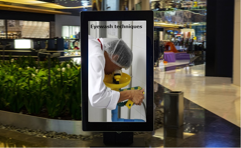
Some information is best conveyed with pictures. Consider eyewash stations, for example. Since eyewash stations are typically not used often, it can be easy to forget the processes surrounding them. But because they are so rarely used, images may be more effective than words when it comes to your presentation. Where they are located, a quick tutorial on how to use them, and a list of the things to avoid—all of these are worth broadcasting on your display, and can be communicated with graphics.
Simple reminders can help workers remember the “common sense” things that result in workplace eye injuries. Visually, this topic can be easy to demonstrate in a presentation like the one you’re creating. Think about having a map showing the locations of eyewash stations. You could also take photos of the PPE and eyewash stations around your facility. This can be particularly helpful since your presentation will use images of familiar equipment that workers pass by daily, even if they don’t use them. And photos aren’t the only visual aids you can use—your eye wellness presentation is a great place to display a deconstructed infographic on how to use an eyewash station properly.
Give viewers enough time to absorb the information before advancing to the next slide
When there is a lot of information on a topic, it can be tempting to put it all on one slide. But if you want passersby to absorb the digital presentation, break up the information over multiple slides and allow the timing to be such that they have enough time to read and absorb it. Even if there are multiple topics within the same presentation, as long as you keep the relevant information within consecutive slides, it will be effective on as many slides as you need. For example, if some of your workers spend a great deal of time on computers, the first part of the presentation may not seem relevant to them. But you can catch their attention next time they walk by the display when the presentation starts to speak to problems specific to their daily tasks.
Remember, your display is part of the workplace environment and workers will have multiple chances to engage with your presentation. Passers-by will have multiple opportunities to see the presentation. Take advantage of this by covering multiple eye-related topics, one after another.
For instance, while trauma is often the first thought when it comes to eye injuries, eye strain is considered a major pain for workers. Follow up your trauma slides with strain slides. To prevent eye strain in the office, ensure workers follow the 20-20-20 rule. For every 20 minutes spent focused on the screen, look at something 20 feet away for 20 seconds to prevent eye strain.
You can follow that with a helpful list of how to identify the symptoms of eye injuries (this list can include both trauma and strain eye injuries to tie it all back together). To ensure viewers don’t get lost, keep the main topic as a header for each slide and list each point as the main point on its own slide. For example:
[Header] According to the American Academy of Ophthalmology, some signs to look for include:
- The person has obvious pain or trouble seeing
- The person has a cut or torn eyelid
- One eye does not move as well as the other
- One eye sticks out compared to the other
- The eye has an unusual pupil size or shape
- There is blood in the clear part of the eye
- The person has something in the eye or under the eyelid that can’t be easily removed
If these points can include images, it makes it easier for the viewer to remember the point being made. And giving a clear call to action like calling 911 or seeking professional medical attention immediately in this case is the point of providing the information.
Creating effective digital presentations takes effort but the more you do it the better you’ll get and you’ll start to build a library of content that can be updated year after year making the process more efficient. And the more people that pay attention to the displays, the more they will start looking for the important information in the presentations when you need them to. And you don’t have to do this all by yourself. Engage your safety committee or people in other departments and work with your safety vendors and partners to see what resources they already have on related topics. If you have access to a design team, give them the pertinent information and allow them to help you create a presentation that will speak to people (even without audio). Given that it’s Workplace Eye Wellness Month, it’s a better time than ever to make your presentations a visual feast.